
Pixel Grid Alignment
Elements snap to a defined grid so spacing remains mathematically consistent across all screen sizes.

INSHOTBOX FOR WEB-DESIGN delivers design output engineered for developers — structured, annotated, and aligned with modern web standards from our studio in Dubai, United Arab Emirates.
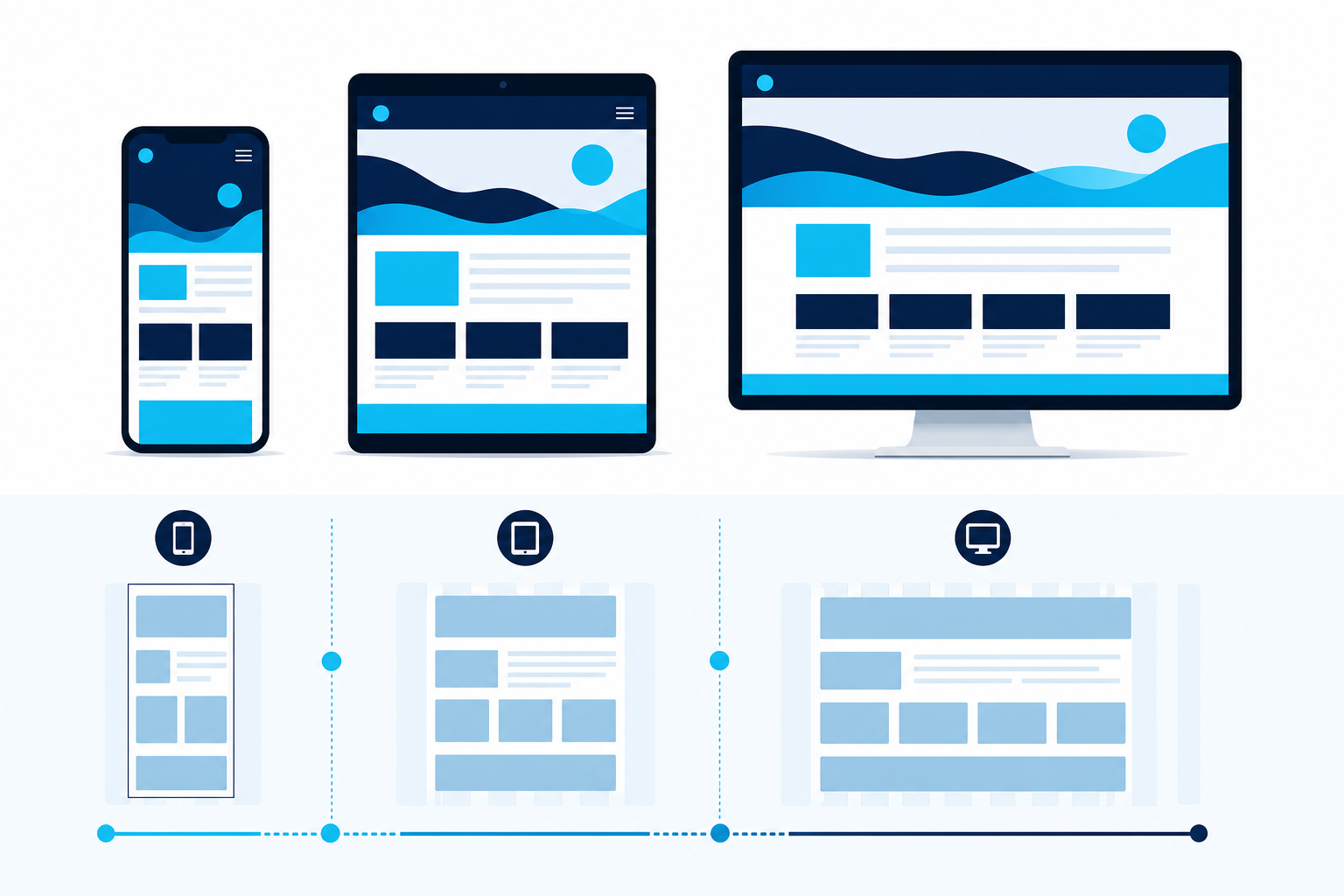
Every layout from INSHOTBOX FOR WEB-DESIGN begins with a mobile-first mindset. Breakpoints are defined by content behavior — not arbitrary device widths — so pages remain legible whether viewed on a compact phone or a wide monitor.
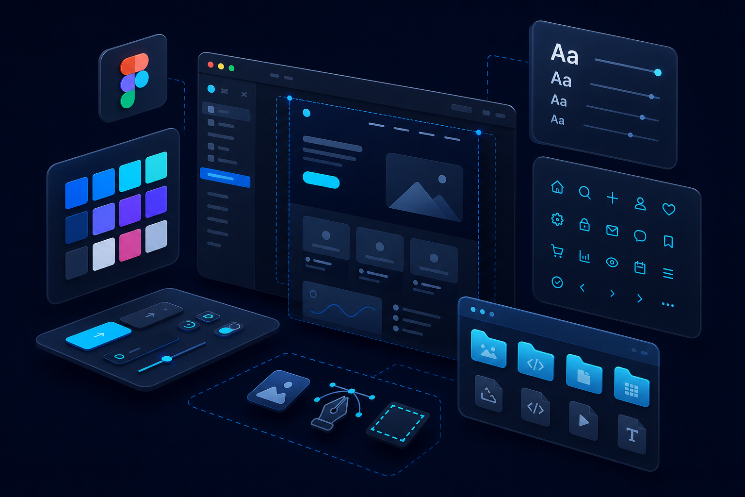
INSHOTBOX FOR WEB-DESIGN packages every project with developer-ready files. Layers are named consistently, components are reusable, and exported assets arrive organized — reducing friction during implementation.

INSHOTBOX FOR WEB-DESIGN treats accessibility and animation as core design requirements — not optional enhancements. Contrast ratios, focus states, and motion timing are planned alongside visual aesthetics.
INSHOTBOX FOR WEB-DESIGN follows a consistent quality framework so every deliverable meets the same level of precision and clarity.
Elements snap to a defined grid so spacing remains mathematically consistent across all screen sizes.
Layers and symbols follow a unified naming convention that developers can navigate without guesswork.
Design files are versioned at each major milestone so revisions remain traceable and recoverable.
Layouts account for rendering differences across major browsers and device rendering engines.
Exported graphics are sized and compressed for fast loading without sacrificing visual sharpness.
Every project includes notes on spacing, states, and behavior so implementation matches the design intent.
Our studio works with industry-standard design platforms to produce files that integrate smoothly into modern development workflows.
INSHOTBOX FOR WEB-DESIGN is ready to scope your project and deliver design files built for precision, clarity, and seamless development handoff.