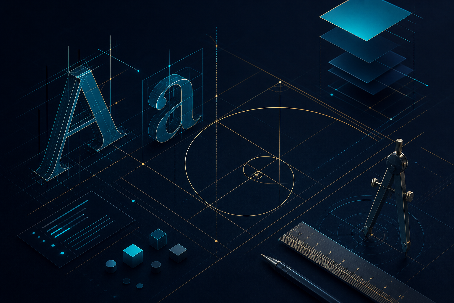
Typographic Voice
Letterforms carry tone before words register meaning. INSHOTBOX FOR WEB-DESIGN selects heading and body pairings that reinforce brand personality while maintaining legibility at every viewport width.

INSHOTBOX FOR WEB-DESIGN treats interface design as a discipline of intention — where type, space, color, and motion converge into experiences that feel inevitable, not accidental.
A website is not a collection of images and text blocks. It is a sequence of decisions — each margin, each font weight, each hover state chosen with purpose. At INSHOTBOX FOR WEB-DESIGN, we measure quality by how those decisions hold together when no one is explaining them.
These disciplines shape every file exported from our studio — independent of project size or industry vertical.
Letterforms carry tone before words register meaning. INSHOTBOX FOR WEB-DESIGN selects heading and body pairings that reinforce brand personality while maintaining legibility at every viewport width.
Whitespace is not empty — it directs attention. Our spacing systems create predictable vertical rhythm so sections breathe and content groups read as distinct, intentional units on the page.
Color communicates hierarchy and emotion simultaneously. INSHOTBOX FOR WEB-DESIGN assigns palette roles — primary, surface, accent, muted — so developers and stakeholders share one visual vocabulary.
Columns, gutters, and alignment anchors give layouts structural integrity. Every element in our files snaps to a defined grid — eliminating the drift that makes interfaces feel improvised.
Buttons, links, and form fields receive deliberate hover, focus, and active states. Micro-interactions at INSHOTBOX FOR WEB-DESIGN signal affordance without distracting from the content they support.
What we design is what gets built. Layer naming, asset resolution, and annotation density are treated as craft — not cleanup — so handoff files from our Dubai studio require zero guesswork.
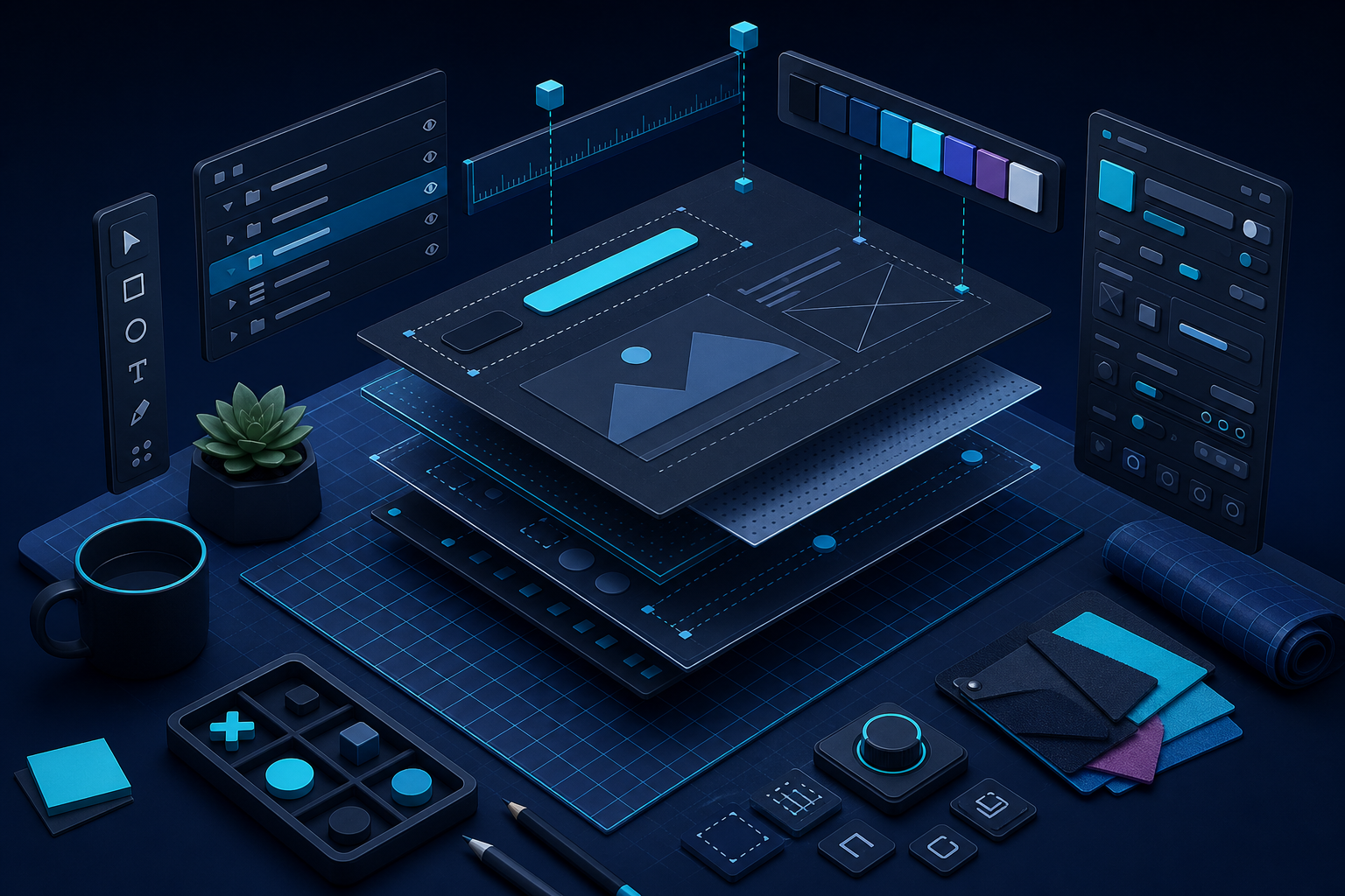
INSHOTBOX FOR WEB-DESIGN operates like a focused workshop — not a production line. Each project receives the same scrutiny whether it spans one landing page or an entire multi-section website. Tools change, but the habit of questioning every placement remains constant.
We sketch structure before styling surfaces. We test readability before approving palettes. We annotate files as if the developer sitting next to us has never seen the project — because clarity at handoff is part of the craft, not an afterthought.
Before color enters the conversation, INSHOTBOX FOR WEB-DESIGN establishes why each block exists on the page. Headlines earn their size through hierarchy, not habit. Images support narrative rather than decorate margins.
This restraint produces interfaces that feel calm and authoritative — the kind of digital presence visitors trust within seconds of arrival. Every section answers a question the visitor did not know they were asking.
Content hierarchy mapped before visual styling begins — structure leads, aesthetics follow.
Alignment audited across every breakpoint, not just the desktop artboard.
Decorative elements removed unless they serve comprehension or navigation.
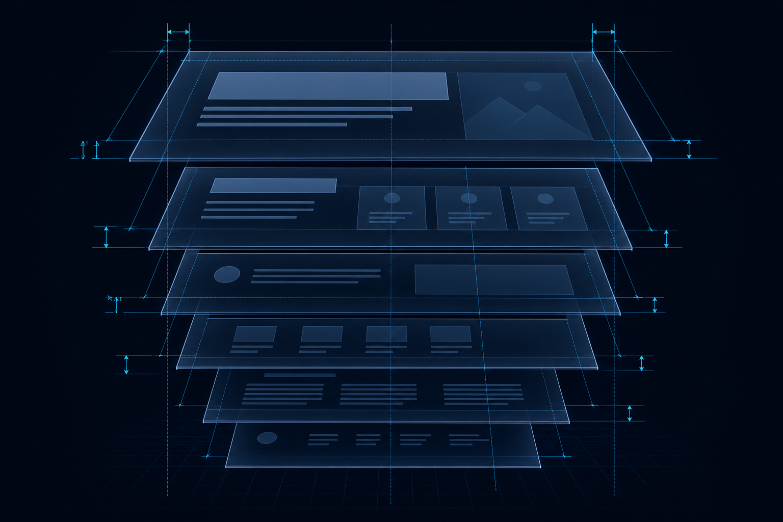
INSHOTBOX FOR WEB-DESIGN builds interfaces from the inside out — each layer must stand on its own before the next is applied.
Page architecture defines what exists and where it sits. Navigation paths, section order, and content grouping are resolved at this level — invisible to visitors but essential to everything above.
Type scale, weight contrast, and line length establish reading rhythm. INSHOTBOX FOR WEB-DESIGN treats letterforms as the primary interface element — long before buttons or imagery enter the frame.
Color, shadow, border radius, and background treatment give the layout its tactile quality. Surfaces communicate elevation and grouping without requiring additional labels or explanation.
Hover states, focus rings, and transition timing complete the experience. Applied last and sparingly — interaction at INSHOTBOX FOR WEB-DESIGN confirms affordance rather than decorating static layouts.
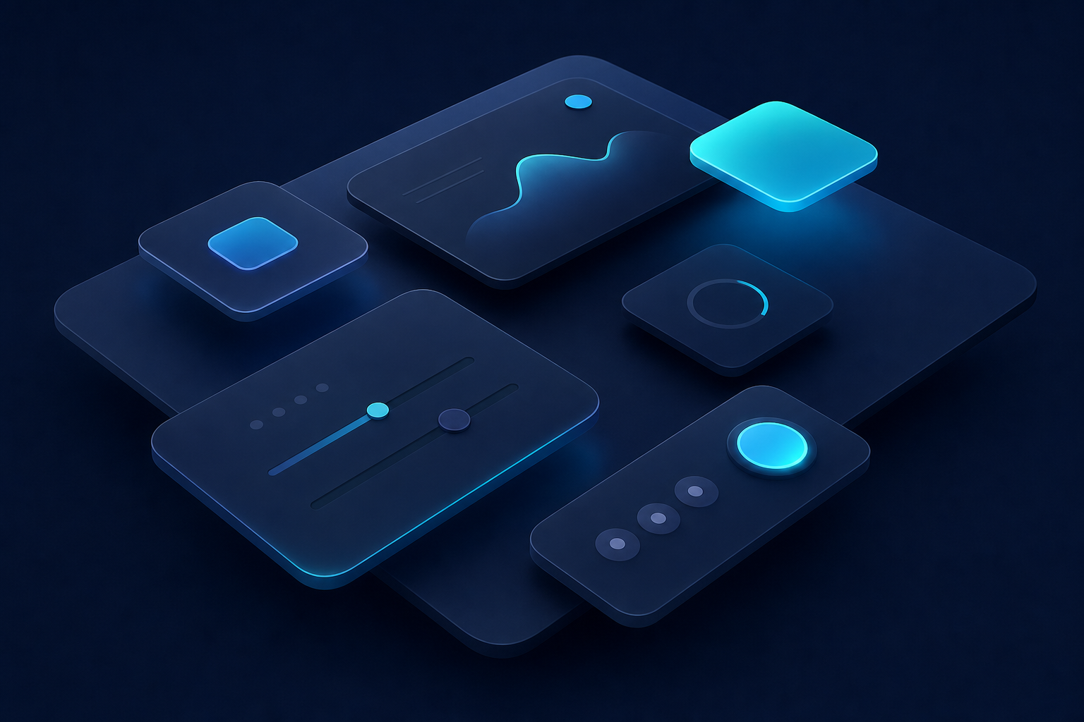
Pixels behave like material — they can feel heavy, light, dense, or airy. INSHOTBOX FOR WEB-DESIGN manipulates contrast, shadow depth, and surface treatment to give flat interfaces a sense of tangible structure.
Cards float above backgrounds. Navigation anchors the top edge. CTAs draw the eye through luminance, not shouting. The result reads as a crafted object, not an assembled template pulled from a generic kit.
Surface elevation defined through consistent shadow and border systems.
Contrast ratios verified for readability in bright daylight and dim rooms.
Depth cues applied uniformly across cards, modals, and navigation bars.
INSHOTBOX FOR WEB-DESIGN does not ship files that look finished at a glance but unravel during development. These boundaries protect the craft on every project from our studio in Dubai, United Arab Emirates.
Layouts built from stock blocks without adapting structure to the brand or audience.
Designs that collapse awkwardly between viewport sizes instead of adapting deliberately.
Source files where layers read "Rectangle 47" and developers must guess intent.
Excessive gradients, animations, or ornament that distract from the message.
Before any screen is marked complete at INSHOTBOX FOR WEB-DESIGN, it passes through these four lenses — each applied without exception.
Every edge, icon, and text baseline aligns to a shared grid. Misalignment is corrected — not tolerated — before any file leaves INSHOTBOX FOR WEB-DESIGN.
Repeated patterns use identical spacing, radius, and stroke values. Variation signals meaning; inconsistency signals neglect.
Animation, color, and ornament are deployed sparingly. When they appear, they earn attention rather than compete for it.
A visitor understands the page purpose without scrolling past the fold. Ambiguity is a design failure we resolve before handoff.
Browse the services INSHOTBOX FOR WEB-DESIGN offers or share your brief — our studio in Dubai, United Arab Emirates is ready to apply this discipline to your next project.