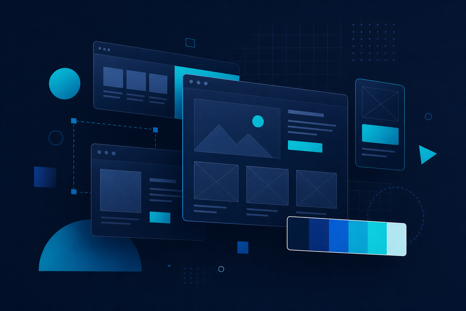
Interface Architecture
We structure page layouts around user intent, mapping navigation paths and content hierarchy before any visual styling begins. This foundation ensures every section earns its place on the screen.

Web Design Studio — Dubai, UAE
We transform ideas into refined, responsive websites that communicate clearly, load fast, and leave a lasting impression on every visitor.
Every pixel serves a purpose. We design websites that balance visual impact with structural clarity — ensuring your audience finds what they need without friction.
We structure page layouts around user intent, mapping navigation paths and content hierarchy before any visual styling begins. This foundation ensures every section earns its place on the screen.
From compact mobile screens to wide desktop displays, our designs adapt fluidly. Breakpoints are chosen deliberately — not arbitrarily — so content remains legible and interactions stay intuitive at every size.
Visual richness should never come at the cost of speed. We optimize imagery, iconography, and animation layers so pages feel snappy while still delivering a polished, premium aesthetic.
Our studio covers the full spectrum of web design — from initial concept sketches to polished, deployable interface files ready for development.
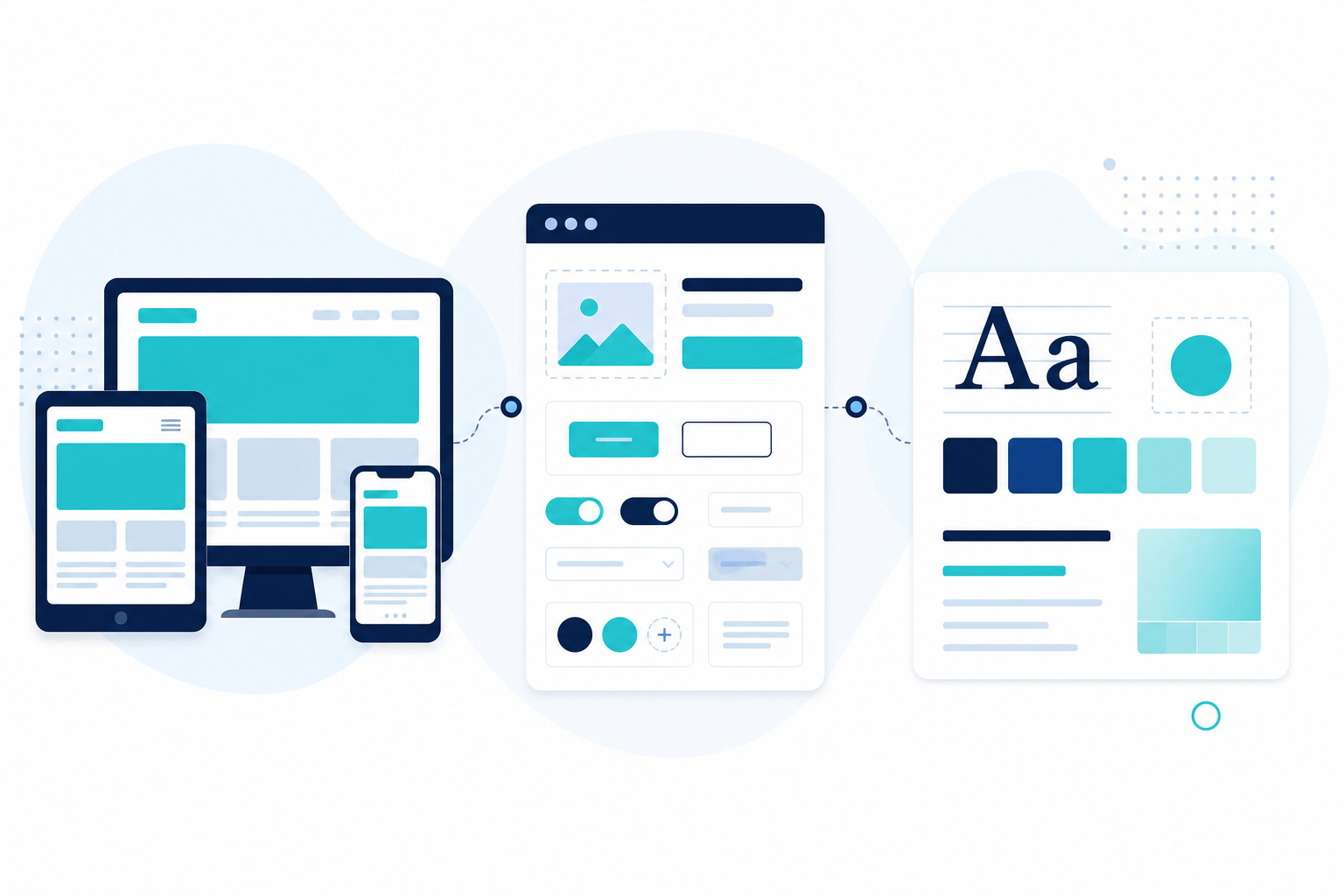
Single-page experiences engineered to capture attention within seconds. We craft hero sections, value propositions, and conversion pathways that guide visitors toward meaningful action.
Comprehensive site architectures with consistent visual language across every page. Navigation systems, footer structures, and internal linking patterns are designed as a unified ecosystem.
Reusable button sets, form elements, card modules, and modal patterns documented for seamless handoff. Consistency across your digital product starts with a well-defined component system.
Color palettes, typography pairings, icon styles, and spacing scales tailored specifically for screen-based media. Your brand reads clearly whether viewed on a phone in sunlight or a monitor in a dim office.
Low-fidelity wireframes and interactive prototypes that validate layout decisions early. Stakeholders can explore page flows before visual design investment, reducing revision cycles significantly.
A transparent, collaborative workflow that keeps you informed at every stage and delivers results aligned with your vision.

We begin by understanding your goals, target audience, and competitive landscape. A detailed creative brief emerges from this conversation, establishing scope, timelines, and design direction.
Gray-scale layouts map content blocks, navigation flows, and interaction points. This skeletal view reveals the logic behind each page before color and imagery enter the equation.
Approved structures receive full visual treatment — typography, imagery, color application, and micro-interaction details. Design files are organized in layered, developer-friendly formats.
Your feedback drives focused revision rounds. We address specific notes with precision rather than broad reworks, keeping momentum toward launch without sacrificing quality.
Final deliverables include annotated design files, asset packages, and style documentation. We remain available during development to clarify specifications and ensure faithful implementation.
Our design output adheres to modern web standards, ensuring seamless translation from concept to code.
The average visitor forms an opinion about a website within milliseconds. Cluttered layouts, inconsistent typography, and unclear navigation silently erode trust before a single word is read.
We approach every project with the belief that clarity is not a constraint on creativity — it is its highest expression. A well-organized page allows bold visual choices to resonate rather than compete. Whitespace becomes a design element. Typography carries authority. Color directs attention with surgical precision.
"Design is not just what it looks like — design is how it works, how it feels, and how effortlessly it serves the person using it."
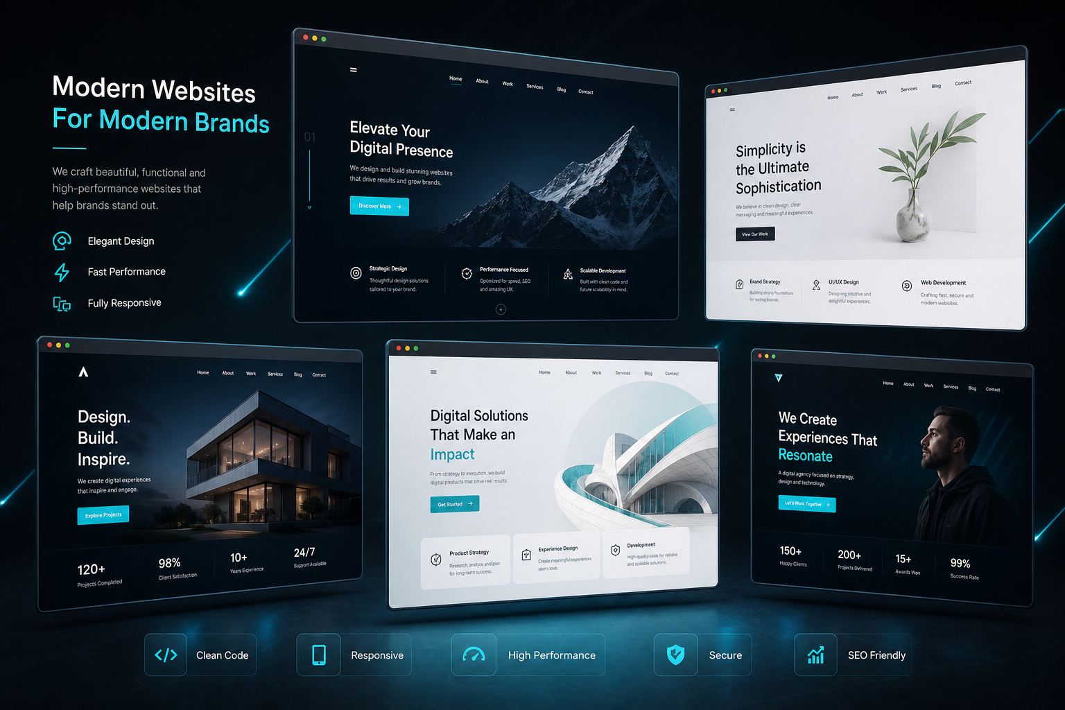
Headlines, subheadings, body copy, and calls-to-action each occupy a defined visual tier. Visitors instinctively know where to look and what to do next.
Buttons, links, icons, and form fields follow unified styling rules across every page. Familiarity breeds confidence — and confidence drives engagement.
Design wraps around content, never vice versa. We allocate space based on what your audience needs to read, not on decorative filler.
Component-based design systems grow with your business. Adding a new page or feature does not require reinventing the visual language from scratch.
Every great website begins with a clear brief. Reach out with your goals, audience, and visual direction — we will map the path from concept to a polished screen-ready design.
A structured design package built for developers and stakeholders alike — no guesswork, no missing layers.
Organized Figma or XD files with named groups, component instances, and version history.
Mobile, tablet, and desktop layouts with defined spacing scales at each viewport.
SVG icons, optimized imagery, and retina-ready graphics packaged for deployment.
Color tokens, type scales, button states, and spacing rules in a single reference sheet.
Send your brief to our email — include references, page count, and any brand materials you already have.